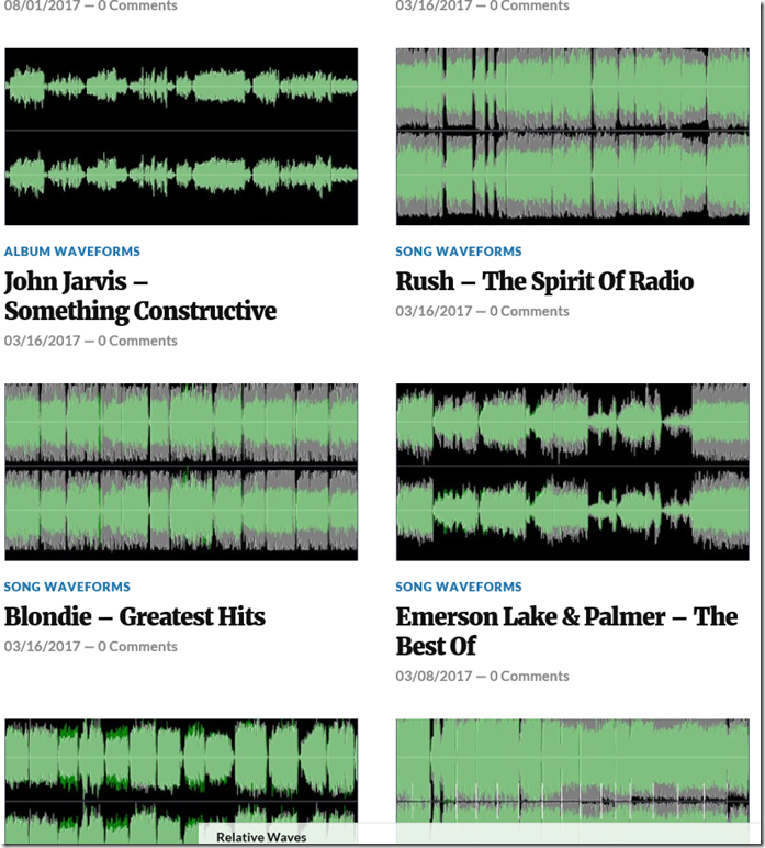
The theme I use for this blog provides a cover photo for each post. I was originally under the impression that I had to assign an image to the cover photo and that image had to be in the media library. Since I store all my images on Flickr, this wasn’t an option. So then I thought I would have a different cover photo for the different categories: Album/Song Waveforms or Discussion. That didn’t seem to be worth the effort, and didn’t look good anyways.
Then one day, after an automatic update from WordPress, images starting showing up on my posts. It was using the first image in the post as the cover photo. The first image in my original template was an icon, which made the cover photo look ridiculous. But with a small rearrangement of the post sections, I got a dramatic visual improvement. You can actually see what you’re getting into.
From:

To

I hope you enjoy this new layout as much as I do.
